No-lose trading targets (based on RSI) By Mustafa ÖZVERThis code shows expected reaction target prices after sudden moving based on RSI. Red area means the price is on overbought area, green area means the price is on oversold area. If you see red area under price, you can make short option to next to the horizontal beginning price of red area. If you see green area over price, you can make long option to next to the horizontal beginning price of green area.
When this code works
- The green area starts where rsi value is on oversold
- The red area starts where rsi value is on overbought
Of course, this code may be failed, do not forget the target may never come. But hopefully price will cross over the target.
And you (as developers) can develop this code by using anything instead of rsi to get up-down target prices.
But only this values can not guarantee good results for trading. BE CAREFUL
Search in scripts for "Up down"

ROSI (ROC of RSI)This indicator attempts to assert the strength of a swing in the RSI. Mind you, not the price, just the RSI. A spike in ROSI 1.b indicates that the RSI has switched direction and should continue trending up/down. The RSI, not the Price.

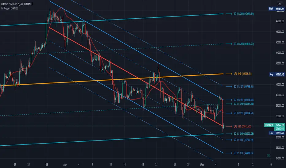
Linear Regression Channel / Curve / Slope by DGTTʜᴇ Lɪɴᴇᴀʀ Rᴇɢʀᴇꜱꜱɪᴏɴ Cʜᴀɴɴᴇʟꜱ
Linear Regression Channels are useful measure for technical and quantitative analysis in financial markets that help identifying trends and trend direction. The use of standard deviation gives traders ideas as to when prices are becoming overbought or oversold relative to the long term trend
The basis of a linear regression channel
Linear Regression Line – is a line drawn according to the least-squares statistical technique which produces a best-fit line that cuts through the middle of price action, a line that best fits all the data points of interest. The resulting fitted model can be used to summarize the data, to predict unobserved values from the same system. Linear Regression Line then present basis for the channel calculations
The linear regression channel
2. Upper Channel Line – A line that runs parallel to the Linear Regression Line and is usually one to two standard deviations above the Linear Regression Line.
3. Lower Channel Line – This line runs parallel to the Linear Regression Line and is usually one to two standard deviations below the Linear Regression Line.
Unlike Fibonacci Channels and Andrew’s Pitchfork, Linear Regression Channels are calculated using statistical methods, both for the regression line (as expressed above) and deviation channels. Upper and Lower channel lines are presenting the idea of bell curve method, also known as a normal distribution and are calculated using standard deviation function.
A standard deviation include 68% of the data points, two standard deviations include approximately 95% of the data points and any data point that appears outside two standard deviations is very rare.
It is often assumed that the data points will move back toward the average, or regress and channels would allow us to see when a security is overbought or oversold and ready to revert to the mean
please note : Over time, the price will move up and down, and the linear regression channel will experience changes as old prices fall off and new prices appear
█ Linear Regression Study Features
Linear Regression Channel
- Linear regression line as basis
- Customizable multiple channels based on Standard Deviation
- ALERTs for the channel levels
Linear Regression Curve
- Linear regression curve as basis
- Optional : Bands based on Standard Deviation or Volatility (ATR). Bands are applied with fixed levels 1, 2 and 3 times StdDev or ATR away from the curve
Linear Regression Slope
- Optional : Up/Down slope arrows for a used defined period
█ Volume / Volatility Add-Ons
High Volatile Bar Indication
Volume Spike Bar Indication
Volume Weighted Colored Bars
Exploring UnicodeThis script demonstrates how to display Unicode characters and symbols, including emoji, in Pine:
• Part 1 displays multi-line labels on hi/lo pivots.
• Part 2 displays price/volume bumps using small up/down arrows plotted with plotchar() .
• Part 3 detects bounces and uses plotshape() to mark them.
You can use our `f_bounceFrom()` function from this part as confirmation for signals in your strategies.
Note that the labels displayed on pivots with the code in Part 1 are plotted in the past. In realtime, they would only appear where they are after 50 bars have elapsed from that point. The other plots are plotted on the bar where their conditions are detected.
You can display thousands of Unicode characters and symbols using Pine. As you can see with our script, it is very easy to do so. The challenge will often be to find the exact symbols you are looking for. Many websites exist to help you explore Unicode characters or symbols. The PineCoders Resources page contains a section presenting a few of them.
Duyck has a Unicode font function script containing functions to convert strings to monospaced Unicode representations. TradingView uses the Trebuchet font for most of its text, including text displayed with Pine scripts. While its numerals are monospace and will align vertically in labels text, Duyck's functions will be handy when you need to convert characters to a monospaced form, so they also align vertically in multi-line labels.
What is Unicode?
Unicode is to character encoding what Wikipedia is to knowledge; it holds codes to a good proportion of the characters or symbols used by humans, past or present. In the early days of computing, environments from different manufacturers often used different character encoding schemes, making transport between them difficult. Unicode solves that challenge. It is a comprehensive encoding scheme that visionaries from Xerox and Apple came up with in the late 80's. The addition of members from the Research Libraries Group, Sun Microsystems, Microsoft, Next and Metaphor created the "Unicode working group" and later, the Unicode Consortium , which continues to improve and manage the Unicode standard.
Theoretically, Unicode encodes values representing characters or glyphs —not their pictorial representations. The letters "A" or "a", or the blue heart emoji "💙" are each represented by a Unicode value. In practice, however, there are many different versions of the Latin alphabet in Unicode. That is how our low pivot label can display different representations of the letters "ITV". The exact rendition of Unicode symbols on a specific device is left to equipment manufacturers and typeface designers.
The current Unicode space is comprised of 17 planes of 65,536 characters each, which allows for more than one million code points . Planes are further divided into character blocks , which typically hold a character set corresponding to one script—or language. Emoticons are in the character block starting at U+1F600.
Look first. Then leap.

Harmonic Scanner ProHarmonic Scanner Pro is a more advanced version of the standard Harmonic Scanner . It lets you customize almost every parameter, check for harmonic patterns much further in the past, and detect multiple patterns at once. It's a great tool to see how specific security reacts to harmonic patterns (some stocks are a textbook example of harmonic patterns , others - not really).
Some of it's features:
You can check an unlimited number of the high/low points (the free version only checks the last 5 points). Use the "Number of points to check" option to configure how many points to check.
Configurable error tolerance - you can set how many % the detected formation can differ from the "ideal" formation. (the free version uses the hardcoded 5% value)
Formations displayed on top of each other can be moved using the "Move chart" option. When two or more formations share the same points on the chart, only the topmost is visible. With the "move chart" option enabled (it's enabled by default), we move all those points up/down a bit to make all the lines nicely visible and easy to follow
Each formation uses different color on the chart, so it's easier to follow them
You can change the width of the ZigZag and formation lines
Detects the Gartley , Butterfly , Bat, Alternate Bat , Crab , Deep Crab , and Cypher .
Important: Checking for more than 200 points and displaying the ZigZag pattern + "No formation" labels at the same time might make the script too slow to render and result in a "Script error". When that happens, disable the ZigZag /"No formation" labels or decrease the number of points to check.
To get 7 days of free access to the script, just leave a comment.
Works for different types of commodities:
Works for different intervals:
Some securities work better than others with harmonic patterns:

NeverBot Basic Momentum ShiftNeverBots Basic Momentum Shift Script
This script is a basic up/down indicator to tell you which way momentum has shifted, this should be used as part of another system to add confluence to your already existing long or short thesis. Uses a simple algebraic equation to define the momentum and when up or down has shifted above/below the other.
Combine this with an MA strategy to get entries for a good hit rate. Typically used for intraday but you can still use this as an indicator for higher time frames.
Crypto is very volatile and momentum can shift within a few minutes which is why you will see some failed signals, but typically it works very well for catching the big moves in crypto as momentum becomes very strong due to FOMO etc..

Price Action IndexI've created a simple oscillator which I think does a good job of easily showing you when price is worth watching or not. I think all too often you get stuck looking at something like an RSI and end up trading noise.
From my observations and experiences, I've found that there are 2 major catalysts for price movement--
Price is either trending and reaches a top or bottom, or
Price is consolidating and ready to make a move in some direction
These movements can be seen quite well from a Bollinger Band, which is what mostly gave me the inspiration. When I watch a chart with a BB on it I see that either you're looking to trade price moving out of a squeeze or riding price up/down the band until it crosses over and makes a move to the moving average.
My solution was to multiply the direction of price by the strength of its deviation.
Price gets converted into a signal between -1.0 (bottom of the range) and 1.0 (top of the range)
Standard Deviation gets converted into a stochastic signal between 0 (next to no deviation from mean) and 100 (highest deviation in lookback)
These 2 get multiplied by each other
The result tells you if price action is trending bullish and if its approaching max strength (perhaps Overbought), example: Price is hitting highs (1.0) and deviation is also at its highest (100) = 100, opposite for bearish
Result can also tell you if price is at the top of the range but the deviation is so tiny and we're mostly pinned to the mean (1.0 * 5 = only 5)
How to Trade this Indicator--
If the indicator is stuck near the middle and purple:
- Don't make directional trades or you'll be eaten alive by the chop
- Good idea to sell options, Iron Condors/Butterflies, etc
- Wait for a move to breakout --> the purple will fade away and give way to a direction
--- As in all trading scenarios, be mindful of fakeouts/short moves to one direction that very quickly get reversed
If the indicator is heading higher:
- This would indicate there is a bull trend going on, get long
- If we are reaching the overbought area, this is an ideal place to take profits or look at spreads like Bearish Call Spreads (sell calls)
- I think you can make your own determination of when to sell by either selling when we're in the overbought area (if it reaches there) or staying bullish so long as it is above the zone
If the indicator is heading lower:
- Bear trend, shorting is possible
- Can use this as a contrarian signal to buy lows
A couple of charts with the indicator and a purple squeeze box I've drawn (can sometimes get noisy in real-time, but hindsight is 20/20)--
Bitcoin on Daily with default 20 length
Gamestop on 30 minute time frame with 100 length
Please feel free to use this indicator for your trading or your own indicators. This particular script is very stripped down/bare bones from what I have been working on as an ongoing project. If TradingView ever returns scripts you can sell, I would probably open that up for a small premium.

[SK] ScouterWelcome to the Scouter Indicator
What you will enjoy the most out of this big combo breaker are the many configuration options that will enable you to play around and explore different ideas that will help you find patterns more easily while keeping a sexy modern aesthetic, in a single indicator selection. The name gets pretty long so you'll want to collapse the indicators list with the dropdown arrow provided underneath it.
Below is the list of the different building blocks of the indicator and the available settings for each.
3Moving Averages -------------------------------
Configuration:
* Toggle On/Off
* Length of data
* Source of data
* 4 Types of averages to choose from:
-- Weighted
-- Exponential
-- Simple
-- Volume Weighted
* Crossovers
-- Moving Average 2
-- Moving Average 3
-- VWAP
-- Source of data
-- OFF to disable
* Color
VWAP --------------------------------------------
Configuration:
* Toggle on/off
* Source of data
* Crossovers
-- Moving Average 1
-- Moving Average 2
-- Moving Average 3
-- Source of data
-- OFF to disable* Color
Action Cloud -----------------------------------
Select 2 plots from the indicators configured to create a filled cloud.
Whenever the bottom edge crosses over the top edge the fill color changes to the 'Down' color.
* Toggle on/off
* Top / Bottom Edge Source
-- Moving Average 1
-- Moving Average 2
-- Moving Average 3
-- VWAP
-- Keltner Boll Midline
-- Bollinger Top
-- Bollinger Bottom
-- Keltner Top
-- Keltner Bottom
* Color Up / Down
Keltner Boll Clouds --------------------------
These are cloud fills that resemble trends or golden areas in the price action.
It's up to interpretation, play around with them and see how useful they can be for your own trading.
North cloud is created from the top of the Bollinger to the Top of the Kernel
South cloud is created from the bottom of the Kernel to the bottom of the Bollinger
Configuration:
* Toggle on/off
* Source of data
* Length of data
* Keltner Multiplier
* Bollinger Deviation
* Cloud style ( Fill, Bands )
* Cloud Transparency
* Show / Hide Midline moving average
* Type of moving average used
* Moving Average Crossovers
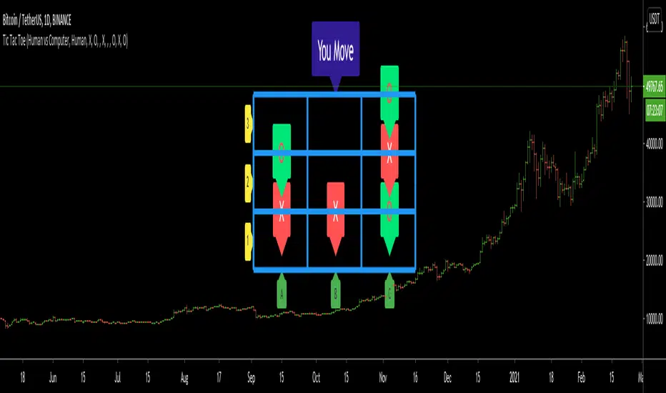
Tic Tac Toe (For Fun)Hello All,
I think all of you know the game "Tic Tac Toe" :) This time I tried to make this game, and also I tried to share an example to develop a game script in Pine. Just for fun ;)
Tic Tac Toe Game Rules:
1. The game is played on a grid that's 3 squares by 3 squares.
2. You are "O", the computer is X. Players take turns putting their marks in empty squares.
3. if a player makes 3 of her marks in a row (up, down, across, or diagonally) the he is the winner.
4. When all 9 squares are full, the game is over (draw)
So, how to play the game?
- The player/you can play "O", meaning your mark is "O", so Xs for the script. please note that: The script plays with ONLY X
- There is naming for all squears, A1, A2, A3, B1, B2, B3, C1, C2, C3. you will see all these squares in the options.
- also You can set who will play first => "Human" or "Computer"
if it's your turn to move then you will see "You Move" text, as seen in the following screenshot. for example you want to put "O" to "A1" then using options set A1 as O
How the script play?
it uses MinMax algorithm with constant depth = 4. And yes we don't have option to make recursive functions in Pine at the moment so I made four functions for each depth. this idea can be used in your scripts if you need such an algorithm. if you have no idea about MinMax algorithm you can find a lot of articles on the net :)
The script plays its move automatically if its turn to play. you will just need to set the option that computer played (A1, C3, etc)
if it's computer turn to play then it calculates and show the move it wants to play like "My Move : B3 <= X" then using options you need to set B3 as X
Also it checks if the board is valid or not:
I have tested it but if you see any bug let me know please
Enjoy!
Buy_Sell_Pressure_v0.62This is a script that I've been using for some time, which covers Volume for me.
It shows the total volumes in typical Column format, however this script attempts to suss out the details of WHERE that volume went (buying or selling), how EFFECTIVE that volume was at moving the price, and finally a COMPARISON of Buy vs. Sell volume MA's showing us the average buying and selling pressure over time, to assist us with determining the timing of a reversal.
The oscillator portion shows us the Volume Columns and the MA's with shadow or offset MA's to detect reversals and crossovers of self, and on the bar/candle chart the bars are colored according to which volume is more dominant at that time.
Alert conditions are available for the following events:
- Buying Crosses over Selling (Bar Color Change)
- Selling Crosses over Buying (Bar Color Change)
- Sell Pressure Cross Up / Down (Single MA Direction Change)
- Buy Pressure Cross Up/ Down (Single MA Direction Change)

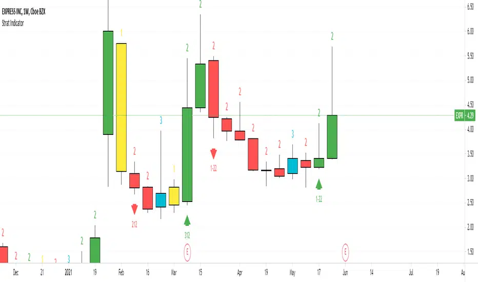
Strat IndicatorThe script implements the Strat method of trading.
Script will label the candles as 1,2,3 where 1 = inside candle. 2 = trend candle, 3 = outside candle.
The bullish , bearish and continuation patterns are labelled with the relevant strat combination
and up, down rrows.
Some setups are
2-1-2 Bearish Reversal = 2 green candle, 1 inside candle, 2 red candle
This indicator can be used in all timeframes.
It can be used on Split screen
for Intraday 1 hour & 15 min
For Swing 1 day & 1 hour
For Long term 1 week & 1 day
For 6 continuous 2 candles, the script will mark the candle as PMG "Pivot Machine Gun" this a big reversal.
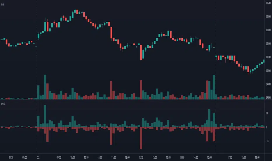
Estimated Up Down VolumeThis indicator plot estimated Up volume and Down volume.
Adjust colors to the default volume indicator.
DR by Caco MaiaCreated by Brazilian trader Caco Maia,this indicator signals an entry when the price breaks through both a slow and fast average while the TRIX and Stochastic are going in the same direction.
Must be used in conjunction with the market context,e.g. Trendlines,Fibonacci Retracements/Extensions or other indicators.
Filter 1 : The Fast Average must be going up/down.
Filter 2 : There`s a limit to the Slow Average inclination,only allowing entries if the Slow Average is "flat" or in the same direction of the signal.
Filter 3 : Uses both Filters.

Multi Time Frame Candles with Volume Info / 3DHello Traders,
This is my second Multi Time Frame Candles script but with this new one, you will have some new features such volume info, remaining time to close of higher time frame candle and also developed using new features of Pine such array of lines. also I tried to make it 3D for better visualization ;) also it shows new highs/lows / breakouts.
I tried to make many things optional, so you can change almost everything using options.
What you can change using options:
- Higher time frame
- Number of Candles
- Candle Colors Up/Down
- Wick Color
- Volume colors Up/Down
- Text color of Remaining Time
- Shadow Color
- Background color
- Start bar of the candles (so you can see many higher times frame candles in same window)
- 3D effect, by default it's enables but you can disable 3D view
Lets see some examples:
Remaining time:
Breakouts:
You can combine different higher time frames:
if you don't want 3D view then combining different higher time frames:
You can change background color:
Enjoy!

Buy The Retrace studyA trend-following strategy entering pullbacks
Simple but efficient
The components of the script:
-MTF ATR based Trend
-Fib based cloud to help determine the trend
-Oscillator which is based on the current close relative to the close-only high-low range over a given period of time
The signal frequency can be changed on:
- Period - Length of the period to look for - i.e 25 means, the last 25 candles
- Bullline - signals created if oscillator above this level
- Bearline - signals created if oscillator below this level
I'd recommend taking the first few signals once the trend has changed.
Alerts are available as:
- First long / short signal
- Long / short signal
- Take profit long / short signal
- HTF trend change any direction
- HTF trend change up / down
Does not repaint - however, wait for a candle to close before entering a signal.

DRC's Force Index
Version 1.2 Update:
No need for scaling up/down anymore
No need for setting up so many parameters
Ability to mix instantaneous indicator with averaged indicator (its different from just making a moving average)
Mass obtention has been improved
Velocity calculation has been improved, by considering highs and lows
Acceleration calculation has been simplified

Barcolor Five Over Five 2021-1-12This setting is pretty simple and straightforward. It is meant to color the price bars based on whether the trend is up, down, or sideways. This setting can be used in any market and becomes devastating when used on multiple time frames.

Crypto _Market_Compare - XRAY vision Showing data from all corners of the crypto market. Each data input has is own color and label for better visuals. Left click the scale on the indicator and turn on "indicator labels" as well as "indicator value" and make sure there is "no overlapping labels".
This awesome visual is a quick glance tool to help you to grasp the health and current state of an asset vs the market and USD. Often traders overlook the importance of this and I always try to study this data to show what is possible for my profit goals and timeframe.
Things to look for and how these :
PATTERNS!
Crossings (up/down)
Levels
Status or Grade of each plot (which is lowest, low, high, higher, highest etc)
Send inquiries via message for paid access.

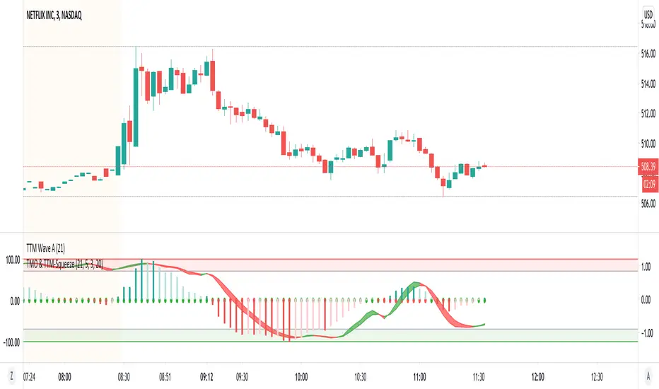
TMO with TTM SqueezeApplication of the TTM squeeze and the short-term momentum TTM Wave A in action. This is an example where the short-term wave will react faster than the TTM to give you a signal to start building your positions.
This indicator needs to be combined with "TTM Wave A" (add to existing pane).
The TTM Squeeze works like a better MACD. There is a zeroline and histogram bars above / below represent positive and negative momo. As the height of the bar decreases when above the zeroline, that is called decreasingly positive momo and as the height of the bar decreases when below the zeroline, that is called decreasingly negative momo. The dots on the TTM Squeeze: Red dots represent consolidation where Bollingers are inside the Keltner Channels and green dots represent a move out of consolidation or "squeeze fire". As price action comes out of consolidation there is a bigger move up/down depending on where momo is heading and where prices are (key support/resistance levels, fib areas). You want to use the TTM Squeeze and A wave TOGETHER - TTM Squeeze is your main momo and your A wave is a short-term momo wave that reacts faster and works as a leading gauge. You need to use them TOGETHER to gauge where price action may be heading. When the TTM Squeeze and A wave move lockstep together, let's say both are decreasingly positive, there is a good probability it continues to move in that direction to the next support levels. TWO bars on the TTM Squeeze of different heights is confirmation that in most cases means it will move in the direction of those bars. So if decreasingly positive, you'll see two darker bars. By the time you get your 2nd bar on the TTM Squeeze, it is often too late or you're losing profit. Way to counter that is after you get one darker bar in the opposite direction of current trend, use A wave to "predict" the next wave, the more A wave histogram bars going towards the other direction, the higher the certainty it will hit. Lastly, using these waves together works best when you look at it on MULTIPLE TIME FRAMES. (Credit for this details goes to Brady from Atlas).
TTM Wave AApplication of the TTM squeeze and the short-term momentum TTM Wave A in action. This is an example where the short-term wave will react faster than the TTM to give you a signal to start building your positions.
This indicator needs to be combined with "TMO with TTM Squeeze" (add to existing pane).
The TTM Squeeze works like a better MACD. There is a zeroline and histogram bars above / below represent positive and negative momo. As the height of the bar decreases when above the zeroline, that is called decreasingly positive momo and as the height of the bar decreases when below the zeroline, that is called decreasingly negative momo. The dots on the TTM Squeeze: Red dots represent consolidation where Bollingers are inside the Keltner Channels and green dots represent a move out of consolidation or "squeeze fire". As price action comes out of consolidation there is a bigger move up/down depending on where momo is heading and where prices are (key support/resistance levels, fib areas). You want to use the TTM Squeeze and A wave TOGETHER - TTM Squeeze is your main momo and your A wave is a short-term momo wave that reacts faster and works as a leading gauge. You need to use them TOGETHER to gauge where price action may be heading. When the TTM Squeeze and A wave move lockstep together, let's say both are decreasingly positive, there is a good probability it continues to move in that direction to the next support levels. TWO bars on the TTM Squeeze of different heights is confirmation that in most cases means it will move in the direction of those bars. So if decreasingly positive, you'll see two darker bars. By the time you get your 2nd bar on the TTM Squeeze, it is often too late or you're losing profit. Way to counter that is after you get one darker bar in the opposite direction of current trend, use A wave to "predict" the next wave, the more A wave histogram bars going towards the other direction, the higher the certainty it will hit. Lastly, using these waves together works best when you look at it on MULTIPLE TIME FRAMES. (Credit for this details goes to Brady from Atlas).

Vision VolumeAfter reading an article on how to trade volume I felt that I needed some kind of indicator using price action and volume together.
More precisely I tried to build two indicators. Bear in mind this indactor is very simple because it only evaluates each bar with its previous bar and an average.
Nr.1 Weak/fake push: Price suddenly goes up/down a lot more but without much volume being traded -> sign of a fake move or low interest
Nr 2 Price action resistance: After an up or down move price suddenly stops moving but high volumes are being traded. This means high resistance from sellers in a rally or buyers in a decline.
This is very simple and as you can see it is often not a clear signal. I will try to improve it further. If a fake move bar (purple) has a close near its new high we don't know if the fake push will continue. As you can see on the chart. some reversal signs come a little to early.
You can re-color labels and turn them off optionally.
This is built for educational purposes only. I hope you find it useful.
Design by Hook

Top 15 overall up and down width of virtual money marketClearly reflect the top 15 up / down ratio of the market value of virtual money market
The deeper the red, the greater the decline.
The deeper the green, the greater the increase.

DMI Stochastic ToltecasModification of DMI Stochastic Indicator created by @usgears
- Added Crossing Up/Down Text Signal
- Added Crossing Up/Down Arrow Signal
- Added Crossing Up/Down Darts Signal
- Added Midline level
- Custom settings for oversold, midline and overbought levels to select a solid, dotted, or dashed line style.
- Added Background Color
